Project Overview
Parents First - Responsive Website and App
The Parents First website and app lets you search for and save articles that help first time parents. It includes unique features such as a “favourites” section and a “you might Like” section. It also includes categories and articles aimed at first time fathers.. The website and app targets audiences who want advice and help on being a first time parent.
My Role: UX Designer
The Goal: Design a website and app that allows people to easily browse, search and save articles as well as having categories, articles and images that represent different demographics equally.
Duration: August 2022 - August 2022


User Research - Pain Points
I conducted interviews and made empathy maps to understand the users I’m designing for and their needs. A Primary user group that I identified were first time fathers who felt that there was not enough information available targeted at their demographic which put them off using websites for first time parents.
Another user group highlighted different factors that contributed to a limited use of first time parent apps/websites. Problems such as wanting a search function to find relevant information more quickly and a way to save pages/articles so they can be revisited were all challenges this user group faced which put them off from using first time parent websites and apps.
1
Features
They want helpful features such as a search function as well as a way to save pages that they would like to revisit.
2
Engaging
They want to website/app to be clear and appealing with plenty of images and not too text heavy.
3
Representation
They would like there to be an equal amount of information/advice and images for first time fathers to view.
Digital Wireframes
As part of the initial design phase, I deigned screens based on feedback and findings from user research.


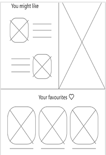
As part of the home page I included a clear search function which helps to improve navigation. I also included a “You might like” section which suggests articles for users based on the previous articles they have read.
Included in one of the article pages are elements such as A heart icon that allows users to “favourite” the article and save it and revisit and at the bottom a selection of articles related to the article above.


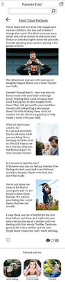
Using the user research, I created multiple screens which show a navigation bar with its own category for fathers. There is also an appropriate ratio of text to pictures in the articles to ensure that they are visually appealing and not text heavy.
Refining the Design - Mock-ups
Based on the insights from my usability study I made changes to improve the heart icon and make it more obvious that it was interactive. Before the usability study, the heart icon was not very clear that it was interactive. After the study I added a hover state where the icon is highlighted and the words “Add to Favourites” appears below, once clicked it then turns to red to indicate the action has been completed..
Mobile App
Before Usability Study

After Usability Study

Another change I made was to the "favourites" section. Before the usability study the “Your Favourites” section did not allow you to delete articles. I have now added a hover state which highlights the article with a red cross appearing, when you click the cross the article is deleted.
Mobile App
Before Usability Study
After Usability Study

Mobile App Mock-ups


Responsive Website Mock-ups


My Final Design

High-fidelity prototype

My Final Design


High-fidelity prototype

Takeaways
Impact
The website enables users to feel that their needs have really been thought about and listened to. The website helps users interact in a personal and more meaningful way.
What I Have learnt
I have learnt that when creating a responsive website you have to be able to adapt your thinking easily and have good problem solving skills.