Project Overview
Flower App - Mobile app
Flower App is an app that lets you order flowers with a wide range of options to choose from. It includes unique features such as a “closer look” function and a customisation option. Flower App targets audiences who want to view flowers in detail and order flowers quickly and easily
My Role: UX Designer
The Goal: Design an app that allows people to quickly order flowers that they can view in detail.
Duration: January 2022 - July 2022

User Research - Pain Points
I conducted interviews and made empathy maps to understand the users I’m designing for and their needs. A Primary user group that I identified was working adults who did not have the time to go in-store to buy flowers but wanted a similar experience when buying them.
This user group highlighted different factors that contributed to a limited use of the florist app. Problems such as picture quality, pictures not being to scale and slow navigation were all challenges the user group faced which put them off ordering from the app.
1
Time
Working adults do not have lots of time, they want a quick and easy app to use.
2
Quality
The picture quality is not always clear and easy to view
3
Realistic
They want the images to show the scale of the bouquets and to look the same on the app as they do in person
Digital Wireframes
As part of the initial design phase, I deigned screens based on feedback and findings from user research.
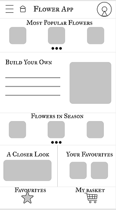
I included clear headings which display many different options when ordering flowers. I also included a clear and quick button to navigate straight to your basket to increase the speed of ordering.

Being able to view the flowers in detail was a key user need to address in the designs so I included A zoom in and out option as well as the option to turn the image 360 degrees to get a full view of the flowers.
Refining the Design - Mock-ups
Based on the insights from my usability study I made changes to improve the checkout service by making it simpler to use. Before the usability study, the checkout process (involving filling out card details and delivery details) were on separate screens. Users wanted this to become simpler to use so I made it into one scrollable screen.
Before Usability Study

After Usability Study

Another change I made was to the interactive buttons and headings. Before the usability study the headings were smaller and the buttons did not stand out. Users wanted more obvious buttons and clearer headings so I increased the font size and added the shadow effect to my buttons.
Before Usability Study

After Usability Study

My Final Design

High-fidelity prototype
Takeaways
Impact
The Flower App makes the users feel that their needs have really been thought about and listened to. The app brings viewing flowers to a new and modern place.
What I Have learnt
I have learnt that you need to be able to adapt your thinking and that changing your designs as you go through the design process is key and not to be afraid of constantly building on what I have already done.